Creating a website style is about much more than choosing attractive colors and modern layouts. A strong visual direction helps build a digital product that is recognizable, functional, and enjoyable to use. The right design style supports business objectives while making the experience easier and more memorable for visitors.
A clear website identity can immediately influence how people perceive a brand. Studies show that users can form an opinion about a website within milliseconds. If the first impression feels confusing or outdated, visitors may leave quickly. However, a thoughtful design can create trust, encourage exploration, and make users want to continue interacting with the site.
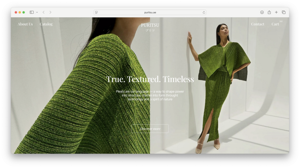
For example, an online fashion store with a clean, elegant, and minimal appearance instantly communicates its audience and brand personality. Even before reading the text, visitors can understand that the website is aimed at people who appreciate refined style and modern aesthetics.
A well-designed style can also improve conversions. For businesses, visual choices are not only decorative—they help guide users toward important actions such as purchasing products, registering accounts, booking services, or subscribing to content.
Design elements such as professional photography, recognizable icons, balanced layouts, and carefully selected colors can create a sense of reliability and encourage users to trust a product or service.
Website style also affects emotion. Different projects require different moods. A clothing store, a creative portfolio, a technology platform, and a music website should not feel identical because each one communicates a different message.
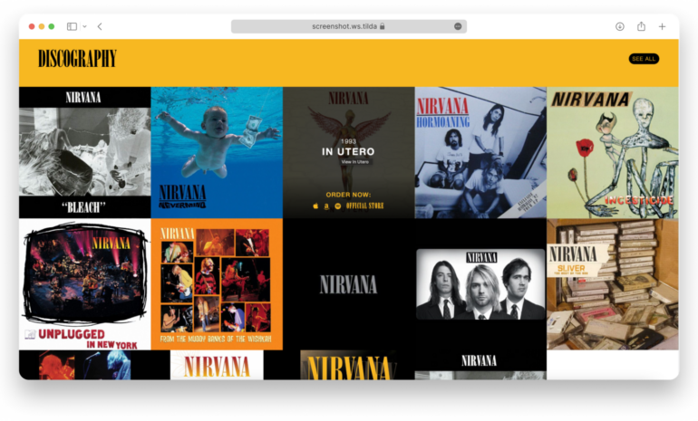
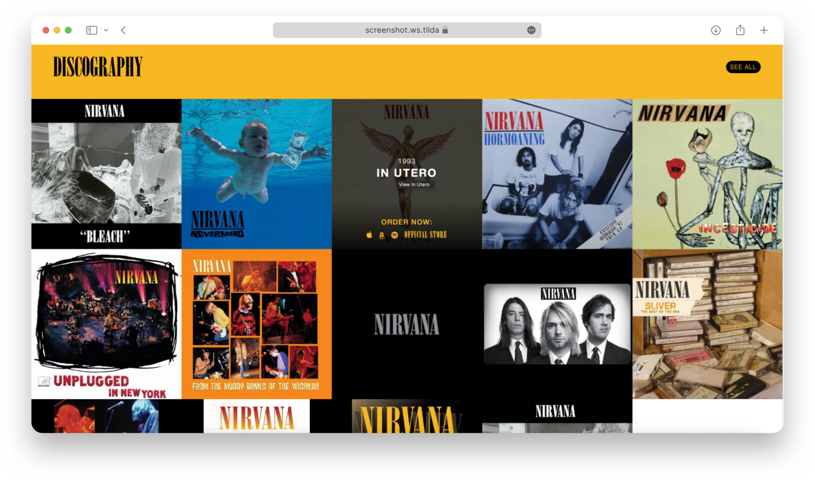
A creative entertainment website, for example, may use expressive typography, strong colors, dark backgrounds, and energetic layouts to reflect personality and excitement.
Popular Website Design Styles and Trends
Web design styles often change alongside trends in fashion, technology, and culture. While some visual directions become popular for a short period, many foundational styles remain valuable because they balance appearance, usability, and user experience.
Understanding these styles helps designers choose an approach that matches the purpose, audience, and personality of a website.
Minimalism
Simplicity with purpose
Minimalist design focuses on removing unnecessary elements and keeping only what is essential. The result is usually a clean, spacious, and highly intentional interface where every component has a clear role.
Key characteristics:
Focused and functional layouts
Minimalist websites avoid visual clutter. Each element should contribute to the user experience, whether it helps navigation, explains information, or highlights an important action.
Careful use of color
Minimal designs often rely on neutral or limited color palettes. Strong colors are usually reserved for important areas, such as buttons, links, or key messages.
The importance of empty space
Whitespace, also called negative space, gives content room to breathe. It improves readability, creates balance, and helps users focus on the most important parts of the page.
Minimalism works especially well for industries where elegance, creativity, and sophistication matter, including fashion, photography, architecture, art, and premium products.
Brutalism and Neobrutalism
Design that breaks expectations
Brutalist web design challenges traditional ideas of polished digital experiences. Instead of focusing on smooth and predictable layouts, it embraces bold visuals, unusual structures, and strong contrasts.
Neobrutalism takes inspiration from this style but often combines the rebellious look with more modern usability.
Key characteristics:
Strong contrasts and unexpected compositions
Brutalist websites often use bright colors, oversized text, unusual spacing, and unconventional arrangements. The goal is to attract attention and create a memorable impression.
Breaking traditional design rules
Hard edges, dramatic typography, sharp shadows, and oversized elements are common. The style feels confident and intentionally different.
This approach is popular among experimental brands, creative studios, startups, and designers who want to communicate originality.
Constructivism
Movement, energy, and structure
Constructivist design is inspired by architecture and geometric composition. It focuses on functionality, strong visual structure, and a sense of movement.
Websites using this style often include asymmetrical layouts, layered images, and dynamic compositions.
Key characteristics:
Simple typography
Clean sans-serif fonts are usually preferred because the message should remain direct and easy to understand.
Geometric forms
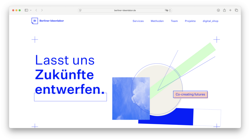
Squares, circles, triangles, and sharp lines create a structured visual language.
Dynamic layouts
Uneven compositions, overlapping elements, and subtle animations help create a feeling of speed and innovation.
Constructivism works well for technology companies, modern businesses, and brands that want to appear ambitious and forward-thinking.
Swiss Style
Precision and clarity
Swiss design focuses on organization, readability, and visual balance. Originally developed through print design, it has become one of the most influential approaches in digital design.
Key characteristics:
Grid-based layouts
Content is organized through structured columns and alignment systems, creating a sense of order and consistency.
Typography-focused design
Simple sans-serif fonts, strong hierarchy, and careful spacing are essential parts of the style.
Balanced visuals
Images and text are arranged carefully, with minimal decoration and a strong focus on clarity.
Swiss style communicates professionalism, reliability, and sophistication, making it suitable for technology companies, financial services, and premium brands.
Editorial Style
Inspired by high-end publications
Editorial web design brings the atmosphere of magazines into digital experiences. It focuses on storytelling, strong visuals, and carefully designed compositions.
Key characteristics:
Creative typography combinations
Large artistic headlines are often paired with smaller, readable text to create contrast and hierarchy.
Layered compositions
Layouts may resemble magazine pages, combining images, text, quotes, and decorative elements.
Strong visual storytelling
Photography, videos, and illustrations play a major role in creating an emotional connection.
Editorial design is ideal for online magazines, blogs, news websites, cultural projects, and content-driven platforms.
Hand-Drawn Style
Creativity through imperfection
Hand-drawn design creates a personal and approachable feeling by using illustrated elements, handwritten fonts, and sketch-like graphics.
Key characteristics:
Handwritten typography
Decorative fonts can add personality but should be used carefully to maintain readability.
Organic visual details
Sketches, doodles, rough textures, and imperfect shapes create a handmade appearance.
Flexible layouts
Unlike strict grid systems, hand-drawn websites often use playful arrangements that feel natural and creative.
This style works well for artists, children’s projects, creative portfolios, and independent businesses.
Retro Design
Bringing the past into the present
Retro web design uses visual references from previous decades to create nostalgia and personality.
Key characteristics:
Vintage color palettes
Warm tones, bold combinations, and slightly faded colors help recreate an old-school atmosphere.
Aged textures
Grain effects, scratches, vintage illustrations, and analog-inspired details add authenticity.
Physical-inspired interface elements
Buttons, shadows, and graphic details may imitate older technology such as arcade machines, radios, or classic screens.
Retro design is often used for cafés, music projects, vintage stores, and entertainment brands.
Flat Design
Simple, clean, and efficient
Flat design removes unnecessary visual effects and focuses on usability, speed, and clear communication.
Key characteristics:
Minimal visual effects
Flat interfaces avoid heavy shadows, realistic textures, and complex three-dimensional elements.
Simple colors
Solid colors and clear contrasts help users quickly understand the interface.
Strong hierarchy
Clear headings, readable fonts, and organized sections improve navigation.
Flat design is commonly used for corporate websites, software platforms, and information-based services.
Bento Design
Organized content in visual blocks
Inspired by the structure of Japanese bento boxes, this style organizes information into separate sections that work together as a complete composition.
Key characteristics:
Structured content cards
Information is divided into individual blocks, usually with rounded corners and consistent spacing.
Efficient use of space
Bento layouts organize large amounts of information without creating visual chaos.
Clear typography
Simple fonts, soft colors, illustrations, and small data visualizations help make content easy to understand.
Bento layouts are especially effective for product pages, dashboards, portfolios, and modern landing pages.
Choosing the Right Website Style
The best design style depends on the brand, audience, and purpose of the website. A luxury company may benefit from minimalism or Swiss design, while a creative project may be better suited to brutalism, collage, or hand-drawn visuals.
A successful website does not follow trends blindly. Instead, it combines the right visual language with usability, accessibility, and a clear understanding of user needs.
When the style matches the message, a website becomes more than a collection of pages—it becomes a memorable digital experience.